|
Redesigning the Game Interface |
 |
 01-16-2009, 09:09 PM
|
#1
|
|
Guest
|
 Redesigning the Game Interface
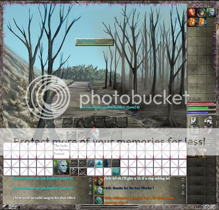
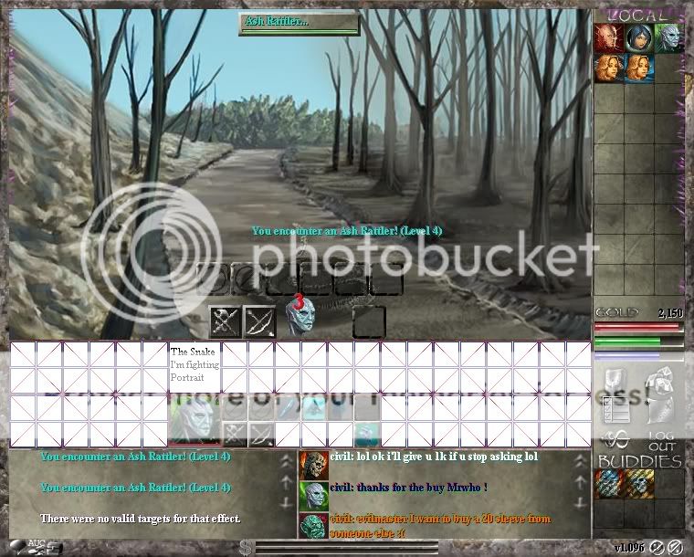
Hy, i've been playing this game for a couple of days and i must say i find it interesting. I like the drawings. But what annoys me is that when i'm fighting a snake or something small, the gem buttons are rigth on top of the animal and i can't see much.
So i thought of a new way things outta be !
Now here is a redesigned window:
Notice how the snake is beneath the gem buttons, and i can't see much of it !
1)Me vs. the Snake
Now, if i happen to be in a party, more things are gonna appear on the image window, and i'm gonna see less of it. My design allows for bigger parties vs lots of monsters:
Example, 8 Player Party vs. 4 Monsters
M2,3,4 = Monster 2 3 4.

Now i haven't realy played against more than one monster, but since there are gems with damage to all, i think i'm gonna encounter such battles in the future.
PM2,3,4,5,6,7,8 = Party Member 1 2 3 4 5 6 7 8
Here's an example of 8Player party vs. 11 Party Monsters:

And of course, guild figths, 8Player vs. 8 Player

EP1,2,3,4,5,6,7,8 = Enemy Player 1 2 3 4 5 6 7 8.
Now i don't know if the game allready has this kinda figths implemented or not, but if it has, there gonna be lots of stuff displayed on the window drawing and i'm not ganna see anything out of it.
My design allows for very big figths and clean window, and also for a bigger Buddy List as you might have noticed.
One obvious side back is that youd have to create portraits for every monster in the game, but that shouldn't be to hard to do. For players there are allready portraits created !
Now, when i created my account here on the forum i got the following message in my mail:
"Thank you for joining the Nodiatis/RWK Forums. We read all the posts in the Ideas and Suggestions forums and highly recommend you contribute. We are always working to make our games better and your feedback really helps. Just remember to be kind to the other posters."
Well, i have done my part of the "contribution". Now i'm waiting for other players opinions, as well for the opinions of game desingners. If they think it's a good idea or not, if it is possible to implement it, or not, etc.
Last edited by Bytales; 01-16-2009 at 09:17 PM..
|
|
|

|
|
01-16-2009, 09:35 PM
|
#2
|
|
Epic Scholar
flipynifty is offline
Join Date: Aug 2008
Posts: 4,529
|
I agree that seeing the stuff would be neato, as the gems in the way do block the view, but i got used to it...
__________________
 omg i wanna sammich nao
|
|
|
|
|
01-16-2009, 09:42 PM
|
#3
|
|
Guest
|
So you do like the interface i designed, don't you ? We should make a poll.
1> I like it and i want it implement.
2> I don't care
3> Current interface is better
But how can i make a poll ?
The Lower bar in which the Player portrait dwells could also serve as a party list outside of combat. You could see on the map your party members.
The enemy bar, while out of combat becomes part of the map, thus, the map displayed is slightly large.
|
|
|
|
|
01-16-2009, 09:48 PM
|
#4
|
|
Epic Scholar
zenga is offline
Join Date: Aug 2008
Location: Somewhere in Belgium
Posts: 2,085
|
with the current trend of smaller laptops and given the fact that many play nod with multiple chars i think changing the resolution is bad practice
|
|
|
|
|
01-16-2009, 09:56 PM
|
#5
|
|
Guest
|
Quote:
|
Originally Posted by zenga
with the current trend of smaller laptops and given the fact that many play nod with multiple chars i think changing the resolution is bad practice
|
You are simply wrong. Let me tell you why.
People with smaller laptops have at least 1366x768 resolution. Game becomes 760x730 from 760x610. Fits perfectly on the said screen. If they have even smaller laptops, that would mean 800x480, but that is very rare. And if they have such a display on their laptop, the current 760x610 wouldn't have fitted anyway.
With the resolution getting bigger, the width is still the same, and if you put 2 windows side by side on a 1680x1050 rez (20-22" screen) you can still play as before.
So i don't see WHY this change shouldn't be implemented ! |
|
|
|
|
01-16-2009, 09:57 PM
|
#6
|
|
Epic Scholar
flipynifty is offline
Join Date: Aug 2008
Posts: 4,529
|
What i have always wanted but never bothered mentioend is the ability to see the monster i am fighting as opposed to the gems i see all the time. But also gem pouches in the battle screen to quickly change to another pouch while in battle. The could also work for equipment sets.
I know, off topic, but i post that suggestion a lot anyway XD
__________________
omg i wanna sammich nao
|
|
|
|
|
01-16-2009, 10:00 PM
|
#7
|
|
Guest
|
Notice there are still 3 spare small squares near the attack buttons. Those could be used for switching pouches in battle. If the designers wish so !
|
|
|
|
|
|
|
|
01-16-2009, 10:27 PM
|
#8
|
|
Epic Scholar
zenga is offline
Join Date: Aug 2008
Location: Somewhere in Belgium
Posts: 2,085
|
Quote:
|
Originally Posted by Bytales
You are simply wrong. Let me tell you why.
People with smaller laptops have at least 1366x768 resolution.
|
Not sure where you got your information from, but there are a bunch of EEE's sold (+ clones). And they have a totally other resolution than what you say 
Quote:
|
Originally Posted by Bytales
Game becomes 760x730 from 760x610. Fits perfectly on the said screen. If they have even smaller laptops, that would mean 800x480, but that is very rare. And if they have such a display on their laptop, the current 760x610 wouldn't have fitted anyway.
|
Now you only need the big square when playing. You can resize your window so that the right side bar and the chat/info window become invisible. And that works very well, for sure with multiple chars open. With your setup you'd need more space to play the game.
Quote:
|
Originally Posted by Bytales
So i don't see WHY this change shouldn't be implemented !
|
Maybe because it will have an impact on many interface things and result queries (AH for example) while there is still a bunch of stuff that needs to be done first (see to do list). Or maybe because the resolution is just fine right now. I mean the idea that for you being able to see a mob the dev needs to redesign his whole interface seems absurd to me. |
|
|
|
|
01-16-2009, 10:28 PM
|
#9
|
|
Guest
|
This has been brought up multiple times over the past few months yet nothing has happened. It appears as though this issue will never be fixed, and that the game artists' work will continue to go unappreciated or, at times, even un-viewed.
|
|
|
|
|
01-17-2009, 04:29 AM
|
#10
|
|
Guest
|
Quote:
|
Originally Posted by Bentro
This has been brought up multiple times over the past few months yet nothing has happened. It appears as though this issue will never be fixed, and that the game artists' work will continue to go unappreciated or, at times, even un-viewed.
|
What issue are you talking about ? My issue ? Or something else ?
It's too bad such good artist work can't be fully viewed. It would have given the game a better view.
If keeping the game resolution is realy a must, i belive another solution could be divised. The viewing area could be smaller, and the 2 rows of characters could take area from the viewing area.
The viewing area could be smaller, but at least we see it all without intreruptions.
I would be happy with either solutions, the thing is maybe there's artwork that will have to get cut down if the designers choose to keep the overall resolution.
I wonder what a game developer thinks about this thread ! |
|
|
|
|
|
|
|
01-17-2009, 03:06 PM
|
#11
|
|
Auction Master
TemariChan is offline
Join Date: Dec 2008
Location: With the man of my life.
Posts: 1,293
|
Quote:
|
Originally Posted by Bentro
This has been brought up multiple times over the past few months yet nothing has happened. It appears as though this issue will never be fixed, and that the game artists' work will continue to go unappreciated or, at times, even un-viewed.
|
Why is it almost EVERYTIME I see one you comments it is 9/10 negitive feed back and it is geting tiresome of seeing it, from now on, im just going to skip reading yours due to it is Rarely anything WORTH reading.
Quote:
|
Originally Posted by Bytales
Hy, i've been playing this game for a couple of days and i must say i find it interesting. I like the drawings. But what annoys me is that when i'm fighting a snake or something small, the gem buttons are rigth on top of the animal and i can't see much.
So i thought of a new way things outta be !
Now here is a redesigned window:
Notice how the snake is beneath the gem buttons, and i can't see much of it !
1)Me vs. the Snake
Now, if i happen to be in a party, more things are gonna appear on the image window, and i'm gonna see less of it. My design allows for bigger parties vs lots of monsters:
Example, 8 Player Party vs. 4 Monsters
M2,3,4 = Monster 2 3 4.
Now i haven't realy played against more than one monster, but since there are gems with damage to all, i think i'm gonna encounter such battles in the future.
PM2,3,4,5,6,7,8 = Party Member 1 2 3 4 5 6 7 8
Here's an example of 8Player party vs. 11 Party Monsters:
And of course, guild figths, 8Player vs. 8 Player
EP1,2,3,4,5,6,7,8 = Enemy Player 1 2 3 4 5 6 7 8.
Now i don't know if the game allready has this kinda figths implemented or not, but if it has, there gonna be lots of stuff displayed on the window drawing and i'm not ganna see anything out of it.
My design allows for very big figths and clean window, and also for a bigger Buddy List as you might have noticed.
One obvious side back is that youd have to create portraits for every monster in the game, but that shouldn't be to hard to do. For players there are allready portraits created !
Now, when i created my account here on the forum i got the following message in my mail:
"Thank you for joining the Nodiatis/RWK Forums. We read all the posts in the Ideas and Suggestions forums and highly recommend you contribute. We are always working to make our games better and your feedback really helps. Just remember to be kind to the other posters."
Well, i have done my part of the "contribution". Now i'm waiting for other players opinions, as well for the opinions of game desingners. If they think it's a good idea or not, if it is possible to implement it, or not, etc. |
I love this idea, this would be a great addition to the game and also to the size issue, I beleave you two forgot about the f11 buttion for a fullscreen view to make it more visable too.
__________________
Do I care if you hate me, do you wanna know the truth? c'est la vie, adios, good riddance, @#$% YOU! ┌∩┐(◕_◕)┌∩┐
|
|
|
|
|
|
|
|
01-17-2009, 05:31 PM
|
#12
|
|
Guest
|
Has any game developer seen this thread. I want to hear their opinion too, because i don't believe it matters to much if other players think it's a good idea, as long as developers don't see the idea, or don't get it implemented.
I don't believe it would be that hard to implement, apart from creating the portrait for monsters.
The lower bar could also be used as a party screen (in world\map view), and it could also display every party member coordinates, to easier see where they are.
I learned today maximum party members is 3. With this new design anew posibility arrises for bigger parties, (up to 8 players), for killing super boses, or multi monsters.
I haven't fought any multi monsters yet. I don't know if that is possible ? Is it ? Are there fights where a group or single player fights multi monsters ?
The good thing about this new design is that it opens posibility for high end content which would be kind hard to do with the curent design.
8 player group, multi monsters, figths vs. super boses, guild figths.
Allthoun in a multi monster figths, an aggro rule should be created (which monster targets which player).
I see great potential in this game, it would be a shame to waste it.
If i had resources and coding knowledge i would probably start making my very own rpg, unfortunatly i have neither of those, i only have ideas.
Besides, a good drawing artist is needed, which are hard to find in my opinion.
|
|
|
|
|
01-18-2009, 06:32 AM
|
#13
|
|
Auction Master
Valiumandritalin is offline
Join Date: Jul 2008
Location: Iceland
Posts: 1,017
|
I'd rather see some of the skills not yet implemented, blending, clans or something worthwhile.
This is ****.
__________________
I am God, I am Techno Viking.
|
|
|
|
|
01-18-2009, 08:21 AM
|
#14
|
|
Guest
|
Speaking as the maker of a site to aid this place, I really want the art so I can use it properly in guides. It's one of the main reasons I'm stalling my new site from public release  |
|
|
|
|
All times are GMT -5. The time now is 10:48 PM
Boards live since 05-21-2008 |
|
|
|